KDE 4.2 Review From Inside Out. Part 2: Applications
I didn't expect the previous part of this review to be so popular. Huge thanks to everyone who read, linked and commented it!
I know I promised you to write about KDE4 applications, so without further ado, here is the continuation.
Table of Contents:Dolphin
I'd like to start my applications review with Dolphin, as it was the most prominent change in the applications area. It was planned to make Dolphin the default file manager since KDE3, but I never tried it then. I got Dolphin with 4.1 and started using it.
Probably I'm too old, but I always liked two-panel console Norton Midnight Commander-alike file managers. They always worked for me in the most efficient way, or at least I felt so. Maybe this was the reason I never liked to use Konqueror in KDE3 for file management. Maybe not. I don't know now. What I know now is that for file management today I use Dolphin. What convinced me to do that?
First, it's Dolphin itself. It's freaking fast. It starts in a moment, it never pauses to read the directory (even my photo archives, without previews of course). Dolphin's performance is convincing.
One more convincing argument for Dolphin is its simplicity and focus. Extreme focus on just file management - nothing extra but plain file management. I adore this approach. Konqueror 3.x as a file manager used to have this bad habit of opening some files as a preview inside the same window, embedding an external application. I always had to go to mime type settings and explicitly tell Konqueror to never use these embedded viewers. Thankfully, this is not an issue now with Dolphin - it simply won't embed anything :)
Those who remember NC, Far, MC and brethren, will remember how useful F3 (quick file preview) was. In the good old days when computers were slow and file formats simple enough to parse - quick preview rocked. In 2009 when computers are too fast for the ordinary user and file formats are damn complicated, you can't have the quick preview. You need the whole application to do the preview for you. Konqueror in KDE3 tried to emulate previews by embedding apps in read-only mode inside. But that didn't quite work. Why would I need a preview when I can launch the full blown application with read-write access in the same time? This is why I like Dolphin for not trying to do previews at all. I double click - and I open the app. No dreaded embedding anymore.
Second reason for me switching from old school panel file managers was that these days I rarely need the file manager. In 1990's your computer session started in the file manager where you'd search for your files to start working on something and ended in the file manager where you'd type the command to shut down the machine. It's 2009 and I prefer more "application and document" oriented approach. I usually launch an application then work with my stuff directly inside it. For instance, I manage my projects with KDevelop, my music with Amarok and so on.
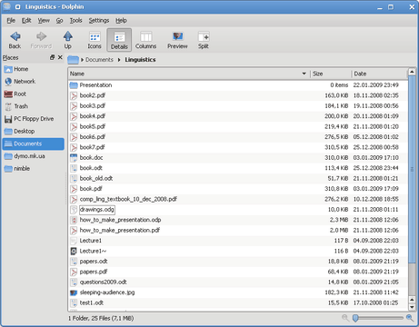
Here is my Dolphin window, nothing fancy really:
Note that I don't have the "Information" panel shown. In fact, I'd advise everybody to avoid it at all cost. Most of the time it will just sit there and eat your CPU and pull your disk trying to make previews and get file stats exactly when you don't need it. So turn it off and make your Dolphin fast. When you need stats - press "Alt-Enter" or choose "Properties" from the popup menu. When you need previews - switch to the "Preview" mode.
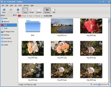
Speaking about "Preview". Did I mention that this mode is gorgeous in Dolphin? No? Then see for yourself:
Preview mode is quick and smooth and the magnifier slider below is an awesome addition to it. I do believe this slider was designed for previews. I don't need Gwenview to quickly review my photos now. I can just use Dolphin. By the way, one hint for those who have modern DSLR cameras or high-megapixel compacts. Go to Dolphin Preferences => View Modes => General and increase the maximum file size for file previews to 10-15 MB. Without this, pictures from your camera will not have previews which would be a real pity ;)
There are more nice things about Dolphin. The Ctrl-I (Filter Bar) feature is exceptionally useful to look for files in the directory. Like most things with Dolphin, it's fast. I'm typing 10 times slower than Dolphin filtering the directory with 4 thousands of files!
But I wish the filtering worked like the search bar in MacOS's Finder. Filtering there recurses into the subfolders. Recursive search + filtering would be a nice addition to Dolphin. I personally will buy a beer or two to the first person who implements that :)
Breadcrumbs-based navigation is another nice file management concept implemented in Dolphin. It doesn't sound groundbreaking for me, but I do use it when my hand holds the mouse. I also like that Ctrl-L shortcut still works as it did with Konqueror, replacing the breadcrumbs with an URL input field and letting me type, for example, the sftp server address. What I really don't like though, is that that input field doesn't remember URLs I've typed. Also Ctrl-L should preselect the URL for me. The most common case is me replacing the URL, not appending to it. I've committed exactly this fix some time ago to the KDE file dialog. Looks like I'll have to do the same with Dolphin :)
Being so simple, Dolphin has only a few problems. But one of them annoys me quite a lot. Split view is not keyboard-navigatable. You can't use Tab and Shift-Tab to switch between views because the focus switches to the magnifier widget. One way to fix that is make magnifier widget not focusable, another - to have one more shortcut to switch between split views. Until this change is done, split view is the feature only for mousers.
Another issue is the questionable value behind Nepomuk (aka "semantic desktop") related functionality, namely commenting, tagging and rating files and folders. I never ever commented any file, I never wanted to as well. I would rate only the audio tracks to make a playlist like the "My Top Rated" that exists in iPod's. But even then, I'd do that in Amarok directly and as I've discovered Amarok and Dolphin do not share the rating. This essentially voids any value of the rating for me.
Tagging? Ok, I can tag my file. What's next? I can't filter for tags in Dolphin, I can't find files by tag with "Find Files/Folders". I'd really like to see the tag-aware operations like these in Dolphin, but they are not there.
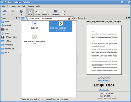
I suppose to get some value from tags I need to use the Strigi Desktop Search. For this review I tried exactly that. I enabled Strigi in System Settings => Advanced => Desktop Search. Then I had my folders indexed. Then I spent half an hour to understand what to do next and how to actually search. As it turned out, to search for tag called "test" you need to type "nepomuksearch:/tag:test" in the URL bar in Dolphin. And that finally worked :)
What I can say? Not only there's low value in new Nepomuk functionality, but there's actually no way for the user to discover and use it. What Dolphin needs is a search box. Search box will be immediately obvious for the user and a little "?" button near it would let people know what search syntax to use. In addition to that, I have a feeling that filtering by tag (preferably recursive) should work in Dolphin right away without any Strigi index from the filter bar.
Conclusion:
Dolphin is an excellent illustration for the "less is more" principle. Simple, focused just on file management and exceptionally fast, Dolphin is a joy to use.
My only complaint about Dolphin is the absence of the advanced search. In particular, I'm looking forward recursive search/filtering features and more close integration of the Strigi search into the file manager.
In any case, Dolphin is definitely one of the reasons to switch to KDE4 and even should you decide not to use the desktop itself, do try Dolphin. It's worth it.
Konqueror
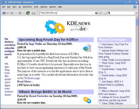
Konqueror from KDE4 for me is now only a web browser. I know it still can be used for file management, but with Dolphin in my hands I'd never use Konqueror for that.
As a web browser, Konqueror 4 is surprisingly good. Its primary goodness is the performance. The application starts and works fast, takes 3 times less memory than Firefox (under the same conditions), the javascript engine and renderer are definitely quick as well. Konqueror may not outperform Safari in terms of speed, but it is definitely on par with any other modern browser.
To make Konqueror even faster, go to Settings => Configure Konqueror => Performance and turn on preloading after KDE startup and set the memory usage setting to "Always". These days I don't use these options because Konqueror is light enough and my PC is fast enough for me to never notice its startup time. Another thing I recommend is to configure browser cache. I always enable "Use cache whenever possible" mode myself. With this option enabled, you have sometimes to reload the page to invalidate the cache, but that is not necessary too often.
The UI in 4th version is simple and succinct. It doesn't have anymore all that bloat that ruined user experience in KDE3 times and it actually has most of the basic web browser features implemented.
For example, I like the tabbed browsing features that come by default in Konqueror. The essential tab management features for me are: opening new tabs in the background, opening tabs right after the current tab and undoing tab close. Konqueror by default has all these features, including the nicely implemented "undo close tab" which works like regular "undo" and is even bound to the same Ctrl-Z shortcut.
Bare Firefox right after installation misses the "open after current" function. But, Firefox has this indispensable Tab Mix Plus extension that easily outperforms Konqueror. I wish Konqueror had Tab Mix Plus' features like "Closed Tabs List" menu and the "Change opening order" mode that opens new tab after the last unread tab.
However, nice set of tab management features comes with an irritating tab switching behavior. Upon selecting the tab, the toolbar flickers. Being a developer, I know why this happens, but the knowledge doesn't satisfy me :) Internally each page is a KHTML component with its own menu and toolbar actions. When you open another page, Konqueror hides menu and toolbar actions for the previous page and shows actions for the new page. Hence the flickering. Understandable, but extremely irritating.
Apart from tabs, another essential web browsing feature these days is ad block. Konqueror's implementation is called "AdBlocK" and is built into the browser. AdBlocK comes without filters, but you can import them. I use the lists for Ad Block Plus Firefox plugin. I recommend importing EasyList first, and then looking for the local list for your country. I add RU AdList and UA-IX banlist. All those lists work fine, but I do miss the Ad Block Plus' ability to update them automatically. Another annoyance is that in Konqueror you cannot have exceptions from ad blocking. Some web sites and applications (like typepad.com) are broken with adblock, so you want to be able to exempt them. Unfortunately, with Konqueror you can't.
In the Firefox land when somebody says that Firefox doesn't do something, the usual answer is "install extension". In Konqueror land things aren't this bright. Konqueror does have an extension interface and even comes with 13 extensions but... unlike Firefox, you need to write extensions in C++ and compile. It's not like this task is extremely complicated, but it does set the high entry barrier for plugin writers. Also it complicates plugin distribution, because you have to cater for various flavors of Linux and also for MacOS and Windows. People who write Konqueror plugins simply distribute them from kde-apps.org site in the source form leaving the burden of plugin compilation and installation for the user which is never a good solution.
If you read up to this point and already think I criticize Konqueror too much, then I'm going to disappoint you. Criticism barely started :) Because Konqueror as a web browser application is fine, but Konqueror (or rather its KHTML engine) as a web page rendering engine is not!
It will render web pages just fine 98% of the time. But even on those pages usually there are glitches. Nothing serious - hidden borders may be visible, buttons and comboboxes may be too big or not focusable from keyboard, fonts may have the wrong size, div's may have wrong positions and so on and so on.
These minor problems tend to sum up together and radically harm the impression from web pages. Usual apology for having such problems is that KHTML/Konqueror's user share is too small for web designers and developers to test pages against the browser and fix the problems. That is of course true, but even if you do want to fix the look of your website with Konqueror, there isn't much what you can do.
I've been developing web applications for almost 3 years and I know the simple fact. As you develop, first you get your site work good with Firefox. Then you tweak some minor things to fix Safari. Then you do some more work and fix Opera. After a week of frustrations and tricky hacking, IE7 will work fine. Another such week and you'll fix IE6. And only after that you go and check your website in Konqueror and fix that.
I hear you screaming "What? Konqueror is worse than IE6"? Believe me, it's true. Even after you get everything to work with IE6, there are usually some things still to be fixed with Konqueror. Also Konqueror doesn't make it easy to fix problems. Javascript debugger is rudimentary and DOM tree explorer is useless. There's no Firebug, no Web Inspector, so it's no wonder web developers don't check their work against Konqueror.
Conclusion
While Konqueror is a nice and fast web browsing application, it is just not good enough for everyday use. Since KDE3 Konqueror definitely improved, but not radically enough. You'd be better off with Firefox or Safari for both everyday use and web development.
I think for Konqueror to be a better browser, two things should be done.
First, QtWebKit should be used as rendering engine instead of KHTML. I want that not because WebKit is technically superior (it's not), but because it's exhaustively tested and because web developers develop and check against it. Also with WebKit on board it will be possible to have so badly needed development tool - the Web Inspector.
Second, Konqueror should have extensions API for Ruby and/or Python. It should be much easier for people to write and distribute extensions written in those languages, therefore it will be much easier to build a developer community around Konqueror similarly to Firefox.
Konsole
Konsole is like a good old workhorse. It just works. Correct terminal emulation, tabs, unlimited history, copy and paste, support for unicode, total keyboard navigation through the interface. What else do you need?
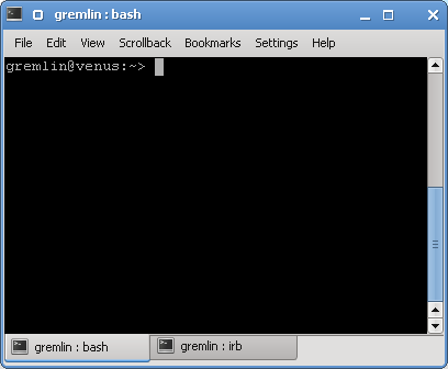
Apart from things I listed, I need and like Konsole's neat monitoring features. First, it highlights the tab where some change happened. This really helps me when I work on several tasks simultaneously (and I do that 90% of my day :)). If you think this notification is too subtle, there's a way to ask Konsole to report activity or silence with the system notification. I personally don't use this often, but silence notification does help to find out when a long-running task completes.

In KDE4 Konsole became even faster (both at startup time and rendering). The UI was improved to increase usability. Also there are now split views, but with a bit strange implementation. When you split, you will see the duplicates of all your tabs in the new split container. I still haven't figured yet how to make use of this feature, but at least unlike Dolphin, I can switch between split view containers with Shift-Tab and even resize them from the keyboard.
From other things that changed recently, I'd like to mention that Konsole tabs in KDE4 are finally named after the program that is running or after the remote host I'm logged into with ssh.
Conclusion
Konsole is still as awesome as it was ever before. With KDE4 it only changed for good so the only thing I have to say here is "Thanks" for Konsole developers! Konsole was one of the reasons I started using KDE back in year 2000 and it's still a compelling reason to switch to KDE4.
KMail
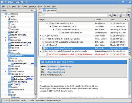
Unless you want to hear the endless flow of praise, please skip this section altogether because I'm just going to say that KMail is awesome :) I'm with KMail since 2001. It was version 1.4 IIRC. Now it's version 1.11 (how conservative, don't you think?) and I'm still with KMail.
My email archive is also still with KMail. I was able to import it from Outlook Express storage back in 2001 and since then kept it in the maildir format without any breakages. I still keep about 3 gigabytes of archives and KMail had never any performance problem because of that.
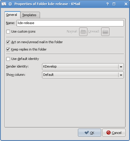
Historically KMail is an excellent tool for those who reads tons of mailinglists. Of course you can put mails from different lists into different folders using the most powerful filtering system I ever saw in mail clients. Proper threading is always a plus. The killer feature is the ability to bind a folder to one your email accounts such that all replies from that folder automatically use the specific address and smtp server. My work-related folders are set up to use my company's email account and my KDE-related folders are set up to use my personal address. This is really convenient.
Some of you could ask why do I mention folders, filtering and threading, aren't they supposed to be the standard in all email clients. That's only because there is GMail now - one of the most popular email "clients" with limited filtering capabilities and with no support for folders. Don't even bother telling me about labels. I receive so much emails, that without proper hierarchical organization into folders and subfolders my mailbox is simply not manageable. Also GMail doesn't do the correct threading. It threads only by subject ignoring "in-reply-to" and "references" headers. Not really useful I'd say.
However, KMail and GMail together make almost a perfect match. You can get all your mail from all your accounts into the GMail and then fetch it with KMail. This way you get the decent spam filtering and still use the right email client, which is of course KMail :)
KMail in KDE4 kept all the goodness it always had, added many of new features and became even faster. My personal KMail hero of the last year is Szymon Stefanek, who gave the new birth to the application during his summer of code project.
As a result of that GSoC project, KMail got new message list with tabbed interface and customizable look, new thread aggregation capabilities, message list themes, new sorting orders and much more. You have to explore the KMail yourself because my blog is just not large enough to present you all those various ways your message list can look like.
I'm conservative. I continue to use "Standard Mailing List" aggregation and "Classic" theme for message list. But what I really really like is how fast KMail is after Szymon Stefanek's refactoring. No, it's not "fast", it's "FAST"! I have huge folders with several thousands emails in them and never notice any slowdowns. The startup time doesn't depend at all from the size of the mailbox. I could easily have 15G of mails and I'm sure KMail would be just as fast as it is now with 3G.
Conclusion
KMail is amazing! It's a pleasure to use - excellent performance, great feature set for mailinglist lovers, single-key keyboard shortcuts for keyboard addicts. I simply can't think what else to ask from it. It will surely please both old-timers and newcomers. Try it, you won't regret!
Akregator
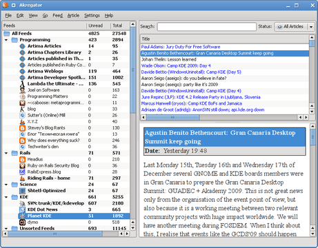
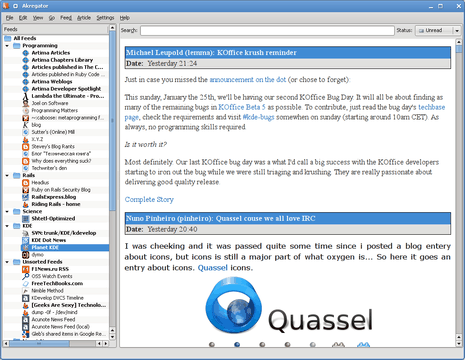
I'm subscribed to the horde of RSS feeds and therefore I frequently use Akregator, the KDE RSS reader. Unlike web-based tools, it's good for organizing your feeds into the tree-like structure just as I like. It's also fine for reading feeds. I wish it used Webkit instead of KHTML to display contents though.
That said, I have to admit Akregator has quite some flaws. For example, it has potentially great "Combined View" when you have the list of feeds on the left and the single page with the complete article contents on the right. This view would be the most convenient for reading if only it wasn't too slow. It will attempt to show all articles in the feed which of course will take ages if you like me have 2000 articles sitting there. I think it should really show only unread articles in that mode.
Another potentially cool feature is Google Reader synchronization, but it also suffers from immaturity. The UI for the feature is not finished and I couldn't log in to my GMail account at all. I'm not even sure whether the synchronization is supposed to work. I wish it worked because that would be the killer feature for me. When I'm away from my computer I want to have my feeds in Google Reader. When I'm back, I want them in the Akregator. That would be really cool, but alas, I couldn't make it work.
Conclusion
Akregator is definitely useful for RSS reading, but so far it doesn't give any compelling reason to use it. Two killer feature candidates (Combined View and Google Reader synchronization) are already there, but they don't work yet. If you used Akregator in KDE3, you'll find the same feature set in KDE4. If you already use another RSS reader, keep an eye at Akregator. Maybe at some point in the future it will have something interesting to offer you.
Update
As draugdel kindly pointed out in the comments, the Combined View mode obeys filtering. So if you set status filter to "Unread", it will no longer attempt to download all articles. This radically changes my experience for better and gives one bonus point for Akregator.
KGet
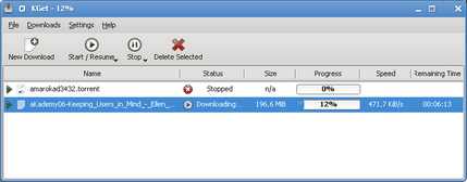
KGet is the KDE downloader. It was there in KDE3, but it really matured since then. KGet that comes with KDE4 is very useful. Not only it has reworked interface that is actually usable, but it has the solid number of features. I'll name only multithreaded file download and and Bittorrent support. Both are not very critical however, but surely nice to have.
Another nice thing is the web interface that lets you control your downloads when you're away from your computer. While I like the idea, I don't quite like the implementation. The web interface doesn't work well with both Firefox and Konqueror - the numerous popups tend to stay on the page and force you to periodically refresh the page.
Conclusion
It's hard to say that downloader can be the application to convince people to use the KDE desktop. But should you need a downloader, you have it in KDE4. And unlike tons of other downloaders out there, this one is good and usable. KGet has all the features and is simple to use at the same time. I like such applications, I like KGet and I hope you will like it as well.
Gwenview and Okular
Now it's time to review the sweet pair of KDE viewer applications - Gwenview, the image viewer and Okular, the document viewer.
Usually, image and document viewers are the indispensable desktop tools. I can't imagine myself using the desktop without them. Both Gwenview and Okular are newcomers in KDE. Gwenview has been in extragear in KDE3 times and Okular grew from KPdf. Both replaced the horde of viewing tools from KDE3 that never worked well. Both do their job and do it really really good.
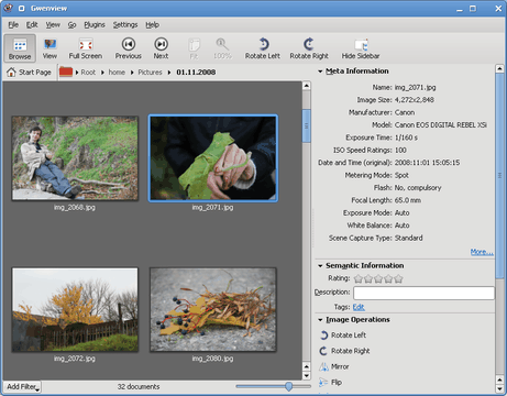
Gwenview is gorgeous. It has everything the image viewer needs to have - browsing and viewing modes, full screen playback, customizable Metadata/Exif display (very useful for DSLR camera owners because you can set up it to show exactly the information you need), basic image editing like mirroring, cropping and red eye reduction. Just as other KDE4 applications I've reviewed, Gwenview is fast and is pleasure to use. During the development a lot of efforts were spent to increase the usability and it now clearly shows off. The application is definitely easy to use. As a nice bonus, it also looks good:
My only wish for Gwenview is the more advanced fullscreen playback. I rather like how iPhoto does slideshows with effects and music and I hope Gwenview will be able to do that as well.
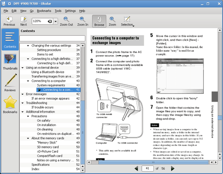
Okular is a great improvement over "KPdf + KDvi + brethren" viewer combination we had in KDE3. First, it's good that now we have the single viewer to open all possible document formats. Second, Okular supports many more formats now and manages annotations for all those formats.
The greatest strength of Okular is of course PDF reading with the support for contents and fast and correct page rendering. I really like to have Djvu and Fb2 (Fiction Book) on board. As a (former) scientist, I have lots of Djvu books. As a literature addict, I also got the large collection of Fb2 books that I keep for my e-book reader. Now I can read all these books in Okular without having to install the dedicated software. Nice, isn't it?
Of course, Okular has also its share of problems. While PDF files looks great, pages from ODT and Fb2 documents don't look as good mainly because of missing font antialiasing. I only wish we could have antialiasing for all possible document formats.
Conclusion
Gwenview and Okular are the results of the serious rework in image/document viewing department that was done during KDE4 development. Both are well-done, usable applications, they support all required image and document formats and are pleasure to use. My kudos to the Gwenview and Okular developers - they did a great job.
Gwenview and Okular can easily speak for itself. Once you try them, you won't look back. I would definitely switch to KDE4 only to get these two applications. Or, just use them with any other desktop. Like I said in the conclusions about Dolphin above, it's worth it!
Grand Conclusion
While writing this review I caught myself repeating the same things about every KDE application, namely excellent performance, usability and great features.
It is so good to see that a lot of work during KDE4 development went into improving the quality of the user experience. Unlike their KDE3 counterparts, the best KDE4 applications are definitely more user-oriented. Despite being a developer, I enjoy this as much as every other person would.
It is equally good to see almost all KDE4 applications being fast. The optimizations behind the scene in Qt and KDE frameworks already showed up, but I think that this is only a start. We will definitely see even more performance improvements in the future.
The KDE "Gang of Five" (Dolphin, KMail, Konsole, Gwenview and Okular) sets the new standards of performance, look, and usability without sacrificing essential features of file manager, mail client, terminal and viewer. If you aren't convinced by the bare KDE desktop, please take a look at these applications, let them speak for themselves!
KDE comes with a lot of good applications and I barely scratched the surface this time again. I haven't said a word about KWrite/Kate - an excellent text editor, Digikam - the ultimate digital photo processing software, Kaffeine - the video player and of course Amarok - my beloved music player. Looks like I have to write yet another part or two :) Come back again!
| Next: | KDE 4.2 on EeePC Mini Review |
| Previous: | KDE 4.2 Review From Inside Out. Part 1 |
